| Access to transplant in PLWH | ||||||
|---|---|---|---|---|---|---|
| Characteristic |
2017
|
2022
|
||||
| Numerator | Denominator | Percentage | Numerator | Denominator | Percentage | |
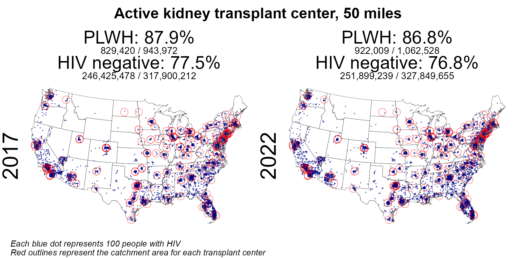
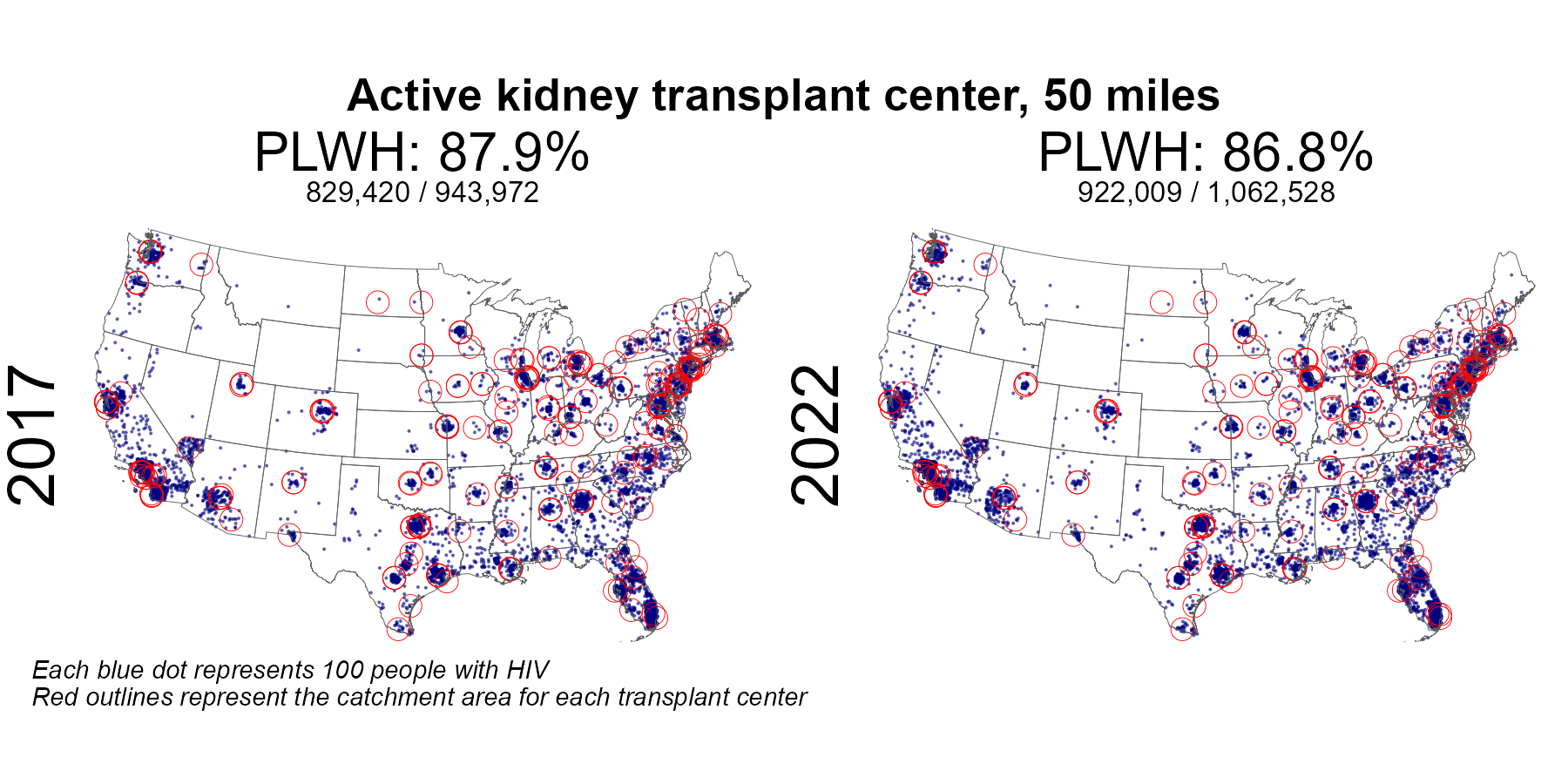
| Active kidney center 50 mile radius | 829,420 | 943,972 | 87.9 | 922,009 | 1,062,528 | 86.8 |
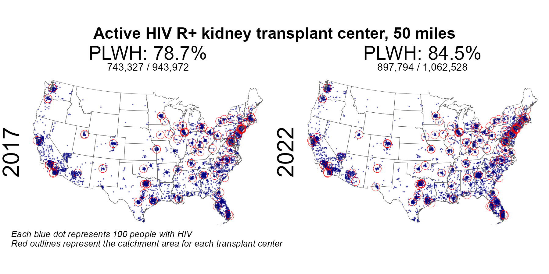
| Active HIV R+ kidney center 50 mile radius | 743,327 | 943,972 | 78.7 | 897,794 | 1,062,528 | 84.5 |
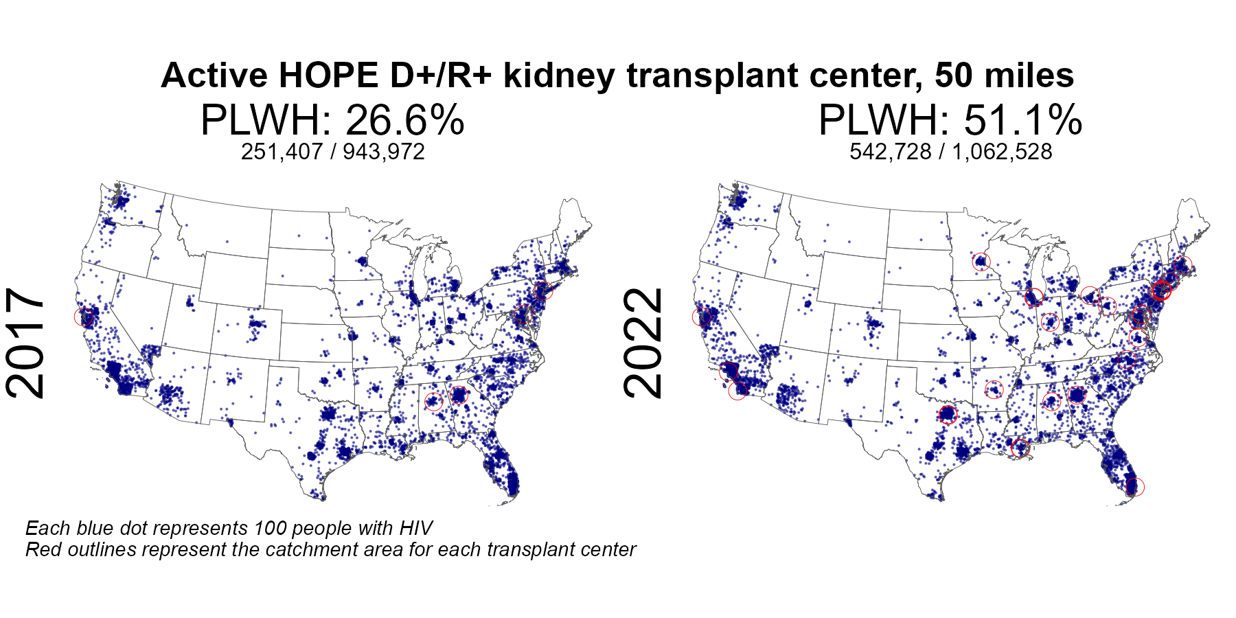
| Active HOPE D+ kidney center 50 mile radius | 251,407 | 943,972 | 26.6 | 542,728 | 1,062,528 | 51.1 |
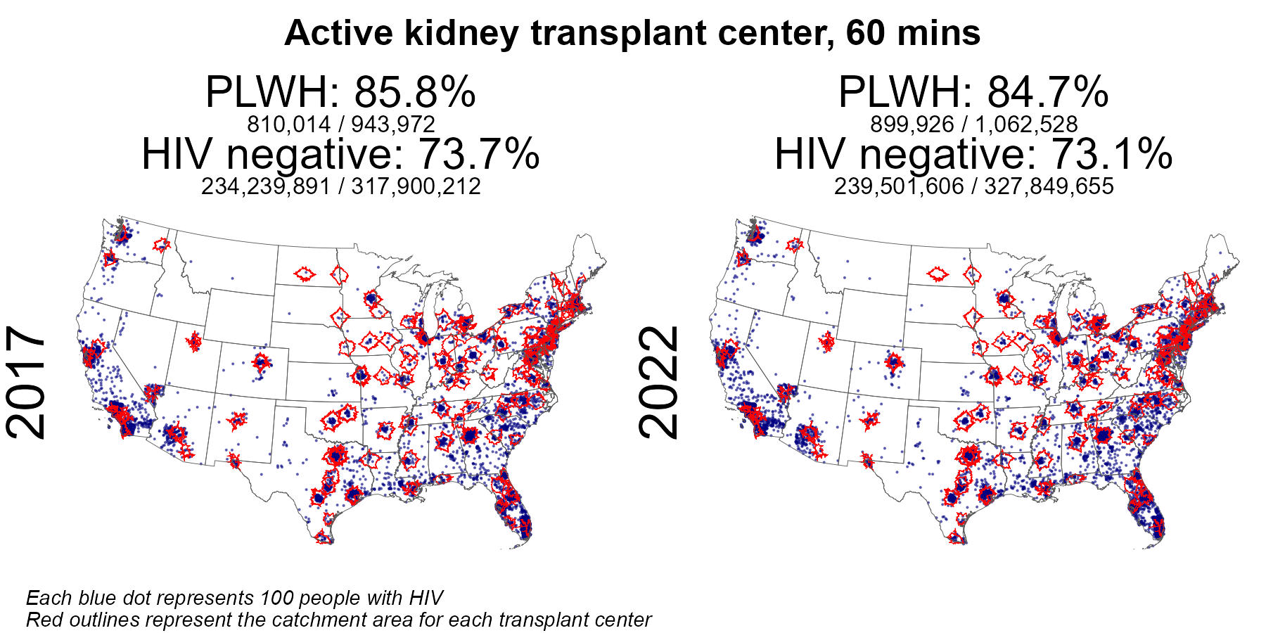
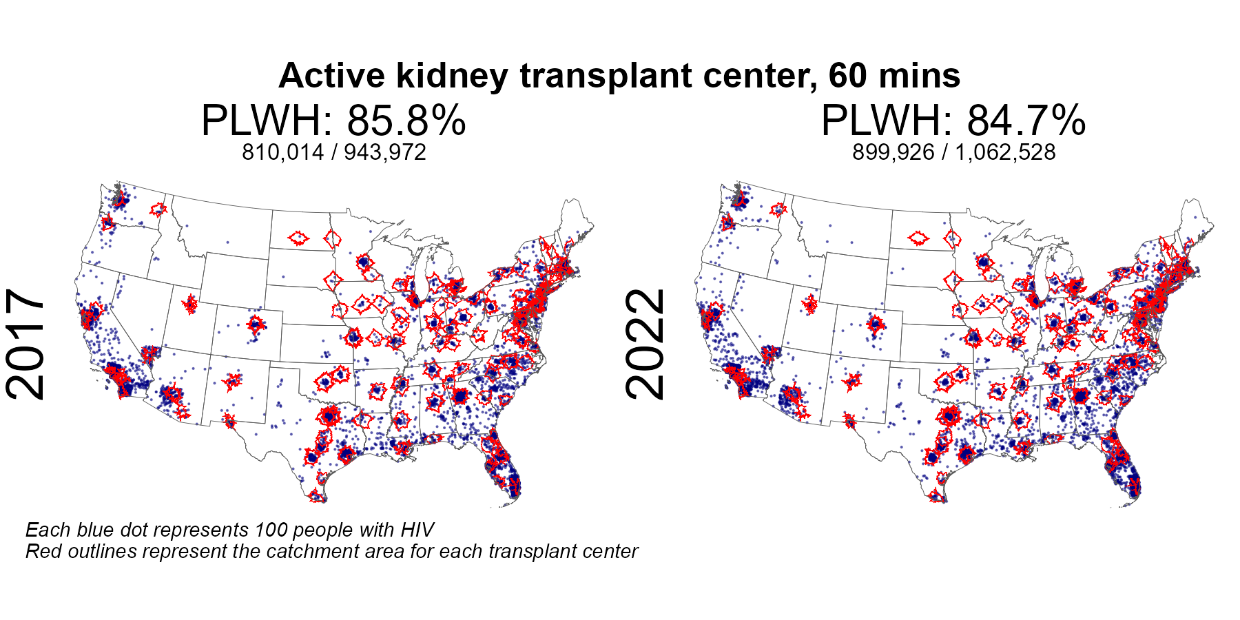
| Active kidney center 60 min radius | 810,118 | 943,972 | 85.8 | 900,207 | 1,062,528 | 84.7 |
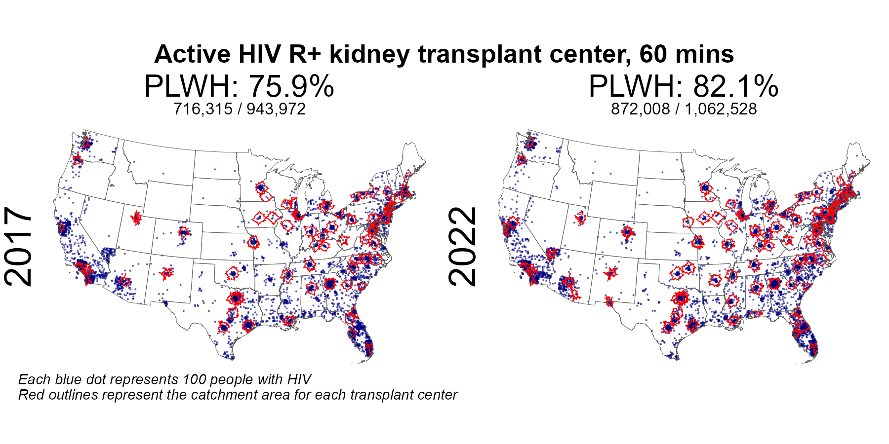
| Active HIV R+ kidney center 60 min radius | 716,562 | 943,972 | 75.9 | 871,997 | 1,062,528 | 82.1 |
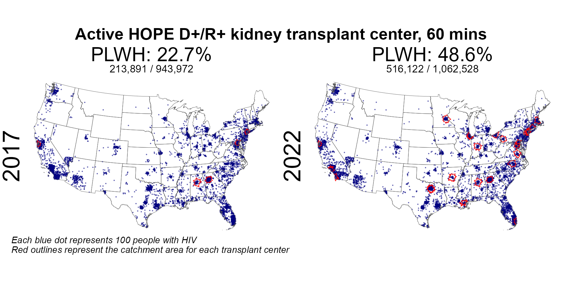
| Active HOPE D+ kidney center 60 min radius | 213,736 | 943,972 | 22.6 | 516,115 | 1,062,528 | 48.6 |
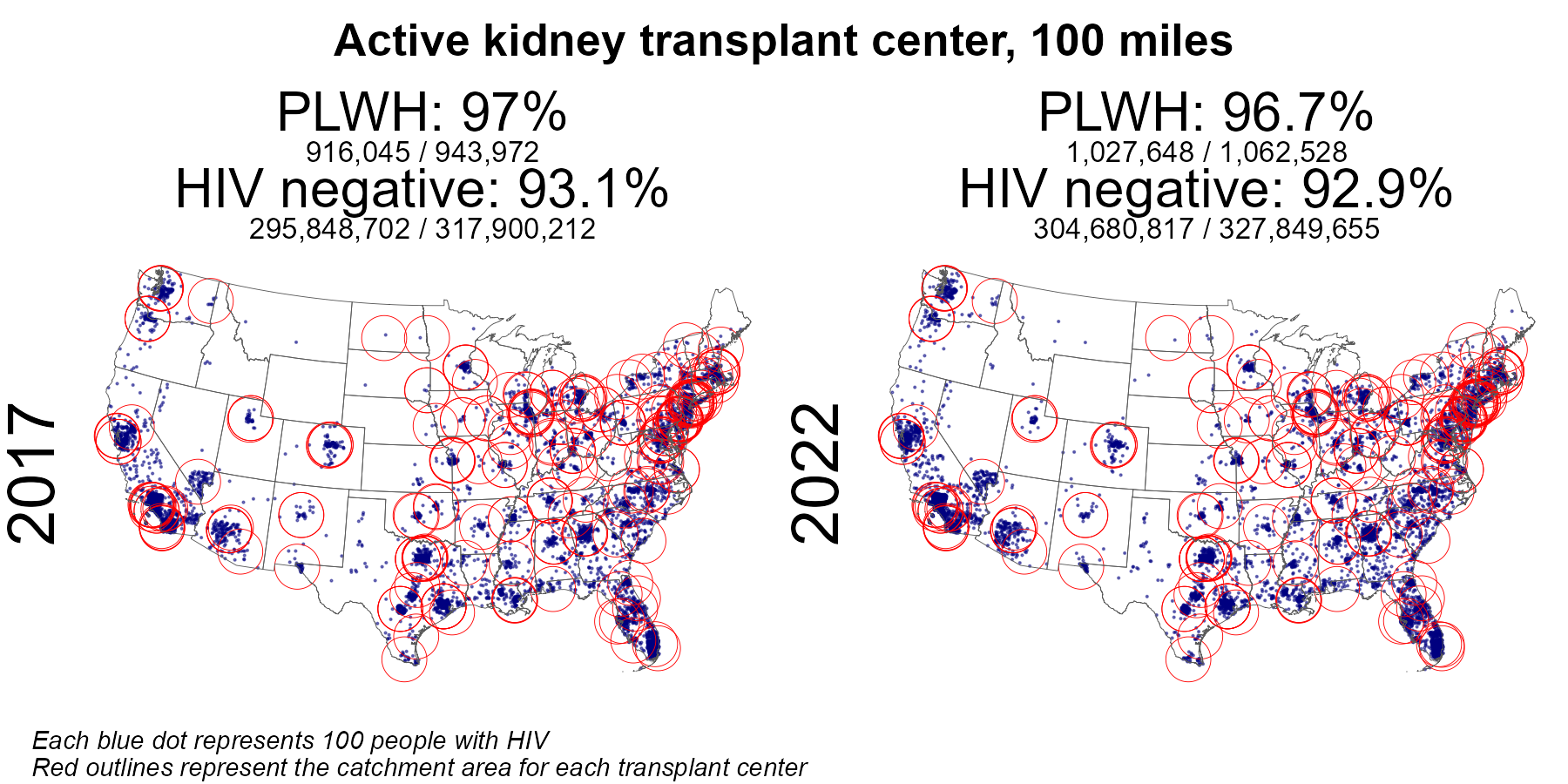
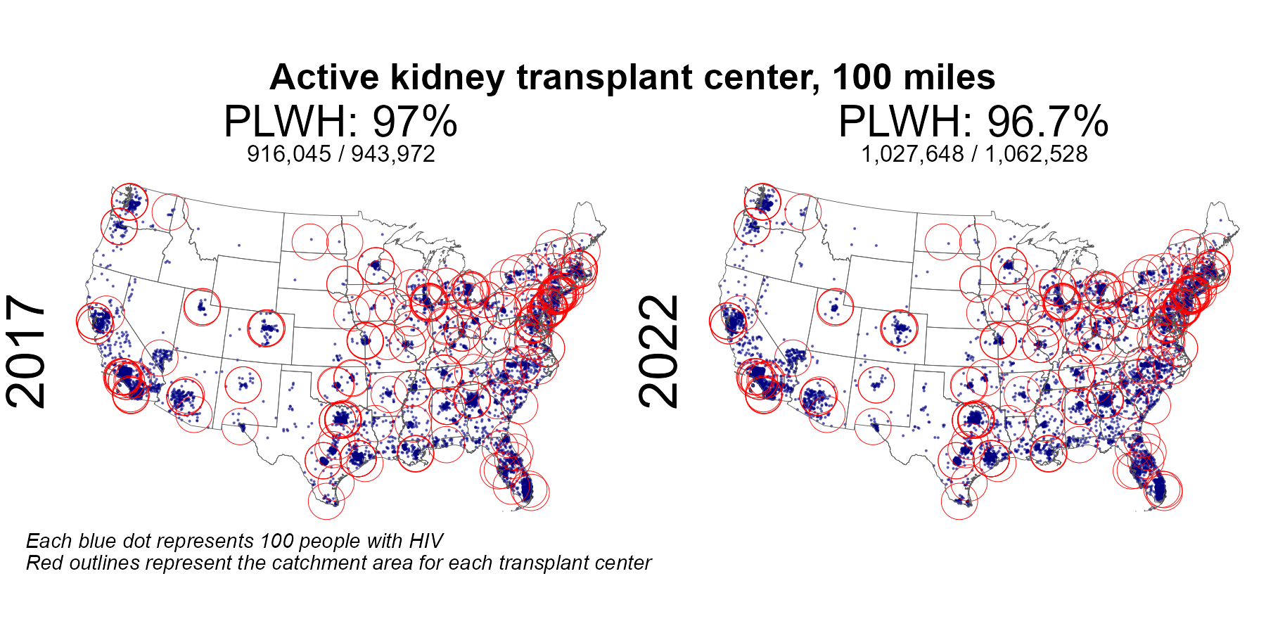
| Active kidney center 100 mile radius | 916,045 | 943,972 | 97.0 | 1,027,648 | 1,062,528 | 96.7 |
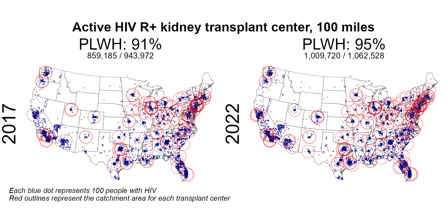
| Active HIV R+ kidney center 100 mile radius | 859,185 | 943,972 | 91.0 | 1,009,720 | 1,062,528 | 95.0 |
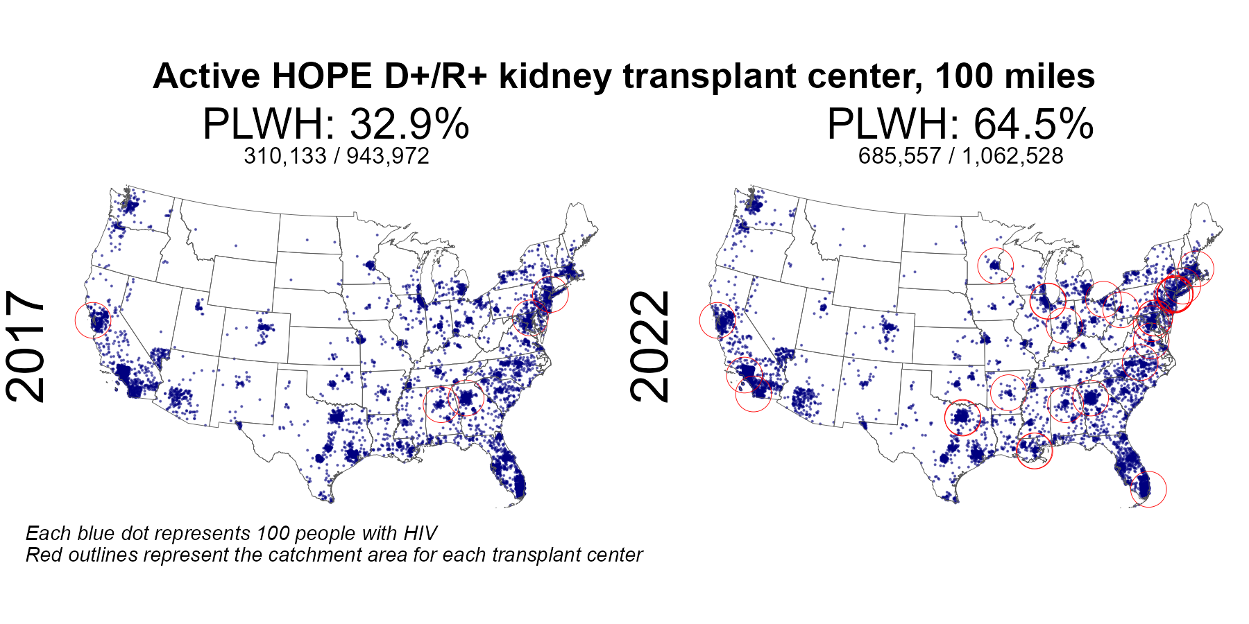
| Active HOPE D+ kidney center 100 mile radius | 310,133 | 943,972 | 32.9 | 685,557 | 1,062,528 | 64.5 |
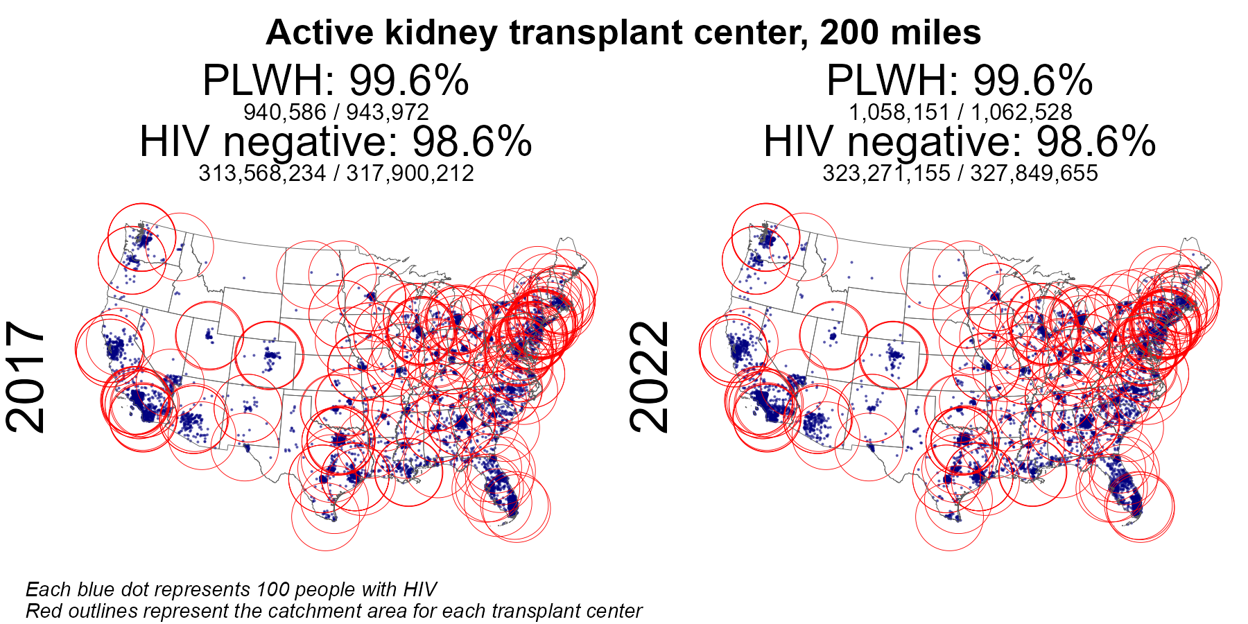
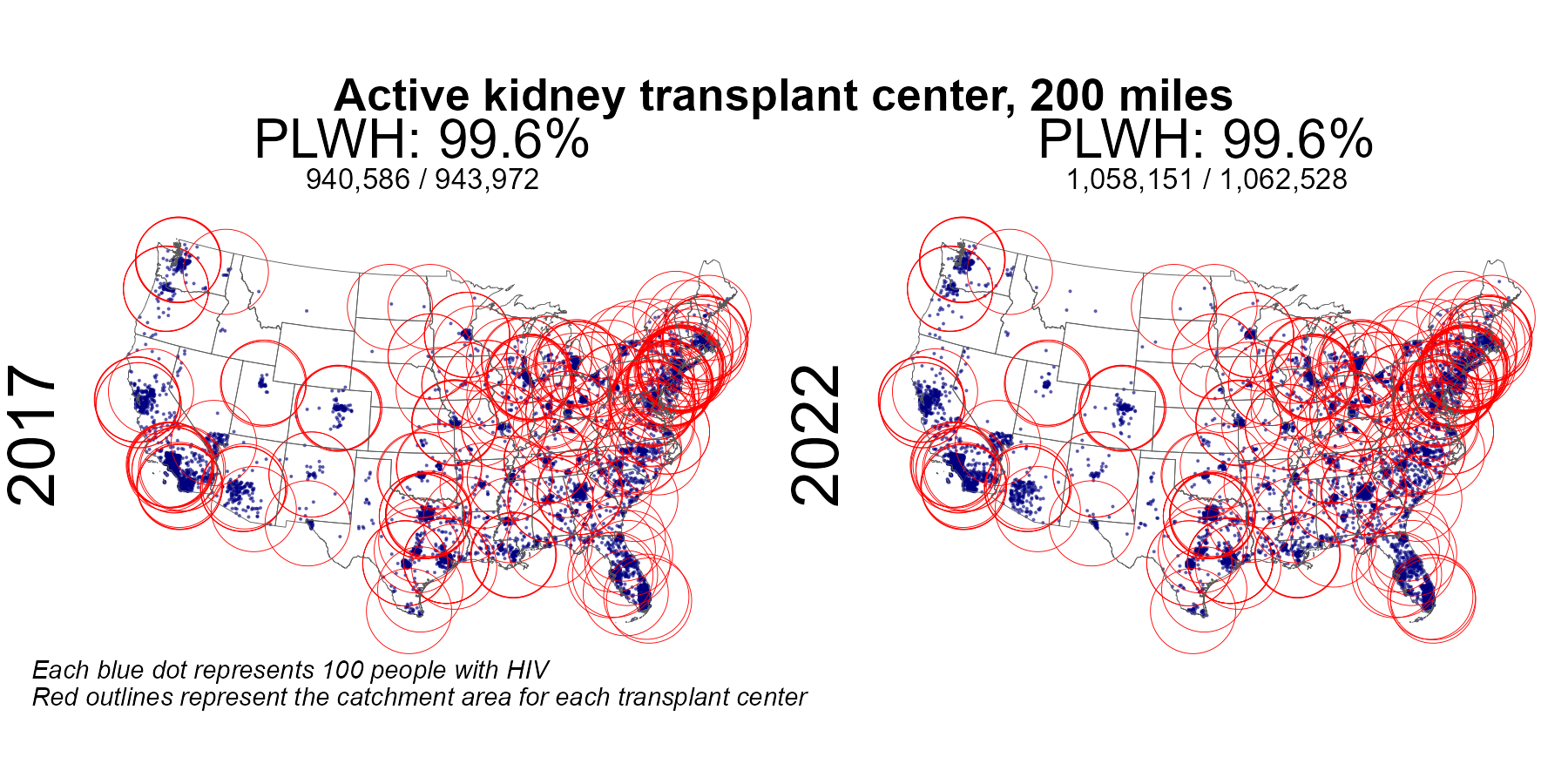
| Active kidney center 200 mile radius | 940,586 | 943,972 | 99.6 | 1,058,151 | 1,062,528 | 99.6 |
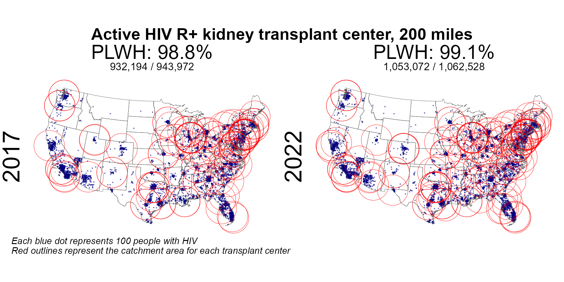
| Active HIV R+ kidney center 200 mile radius | 932,194 | 943,972 | 98.8 | 1,053,072 | 1,062,528 | 99.1 |
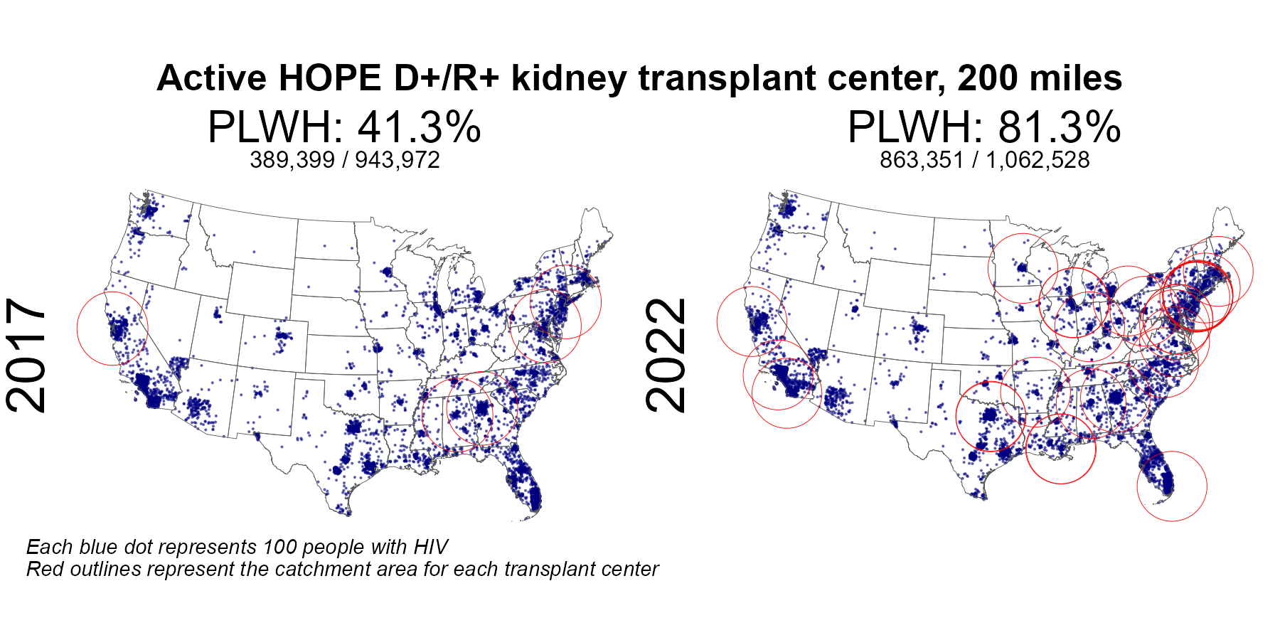
| Active HOPE D+ kidney center 200 mile radius | 389,399 | 943,972 | 41.3 | 863,351 | 1,062,528 | 81.3 |
Results: kidney
Table 1 and Table 2: Summary results in PLWH and without HIV
Table 1: People Living With HIV (PLWH)
This table summarizes the number and proportion of people living with HIV who reside within defined catchment areas of:
- Active transplant centers
- HIV R+ transplant centers
- HOPE Act D+ centers
Catchment areas are defined by:
- 50-mile radius
- 60-minute driving time
- 100-mile radius
- 200-mile radius
Results are shown for 2017 and 2022.
Table 2: Individuals Without HIV
This table presents the same catchment analysis for individuals without HIV.
It allows direct comparison of geographic access between:
- PLWH
- Individuals without HIV
| Access to transplant in people without HIV | ||||||
|---|---|---|---|---|---|---|
| Characteristic |
2017
|
2022
|
||||
| Numerator | Denominator | Percentage | Numerator | Denominator | Percentage | |
| Active kidney center 50 mile radius | 246,425,478 | 317,900,212 | 77.5 | 251,899,239 | 327,849,655 | 76.8 |
| Active kidney center 60 min radius | 234,289,463 | 317,900,212 | 73.7 | 239,610,458 | 327,849,655 | 73.1 |
| Active kidney center 100 mile radius | 295,848,702 | 317,900,212 | 93.1 | 304,680,817 | 327,849,655 | 92.9 |
| Active kidney center 200 mile radius | 313,568,234 | 317,900,212 | 98.6 | 323,271,155 | 327,849,655 | 98.6 |
Figures
Figures are grouped into three sections.
Compare PLWH and non-HIV
These figures compare geographic access between PLWH and individuals without HIV within each catchment definition.
Each panel corresponds to a distance-based definition:
- 50 miles
- 60 minutes
- 100 miles
- 200 miles
These figures highlight disparities in access by HIV status.
Compare PLWH Between Years
These figures evaluate changes in geographic access among PLWH between 2017 and 2022.
For each catchment definition, results are shown for:
- Active centers
- HIV R+ centers
- HOPE Act D+ centers
This section highlights temporal changes in transplant center availability.
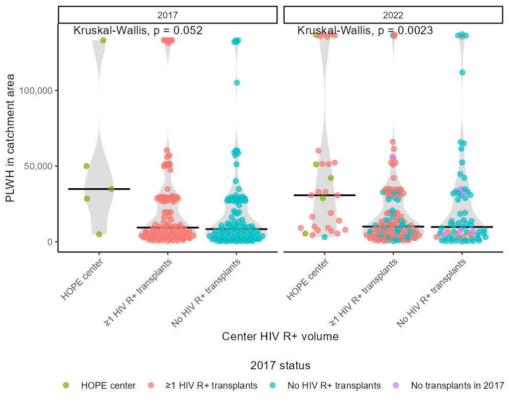
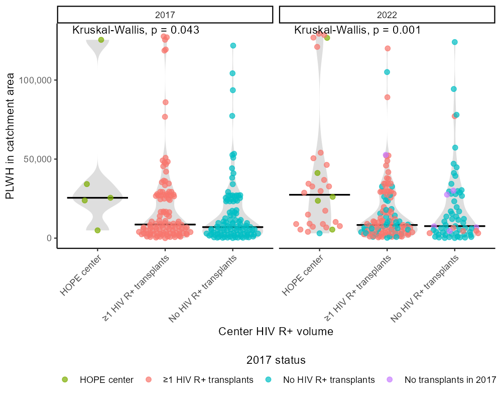
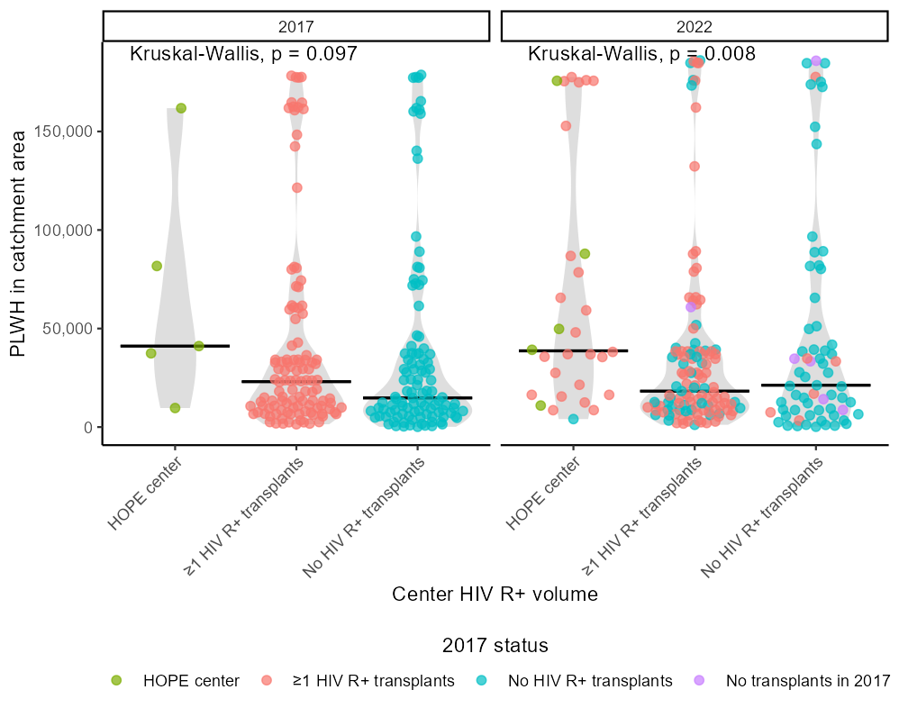
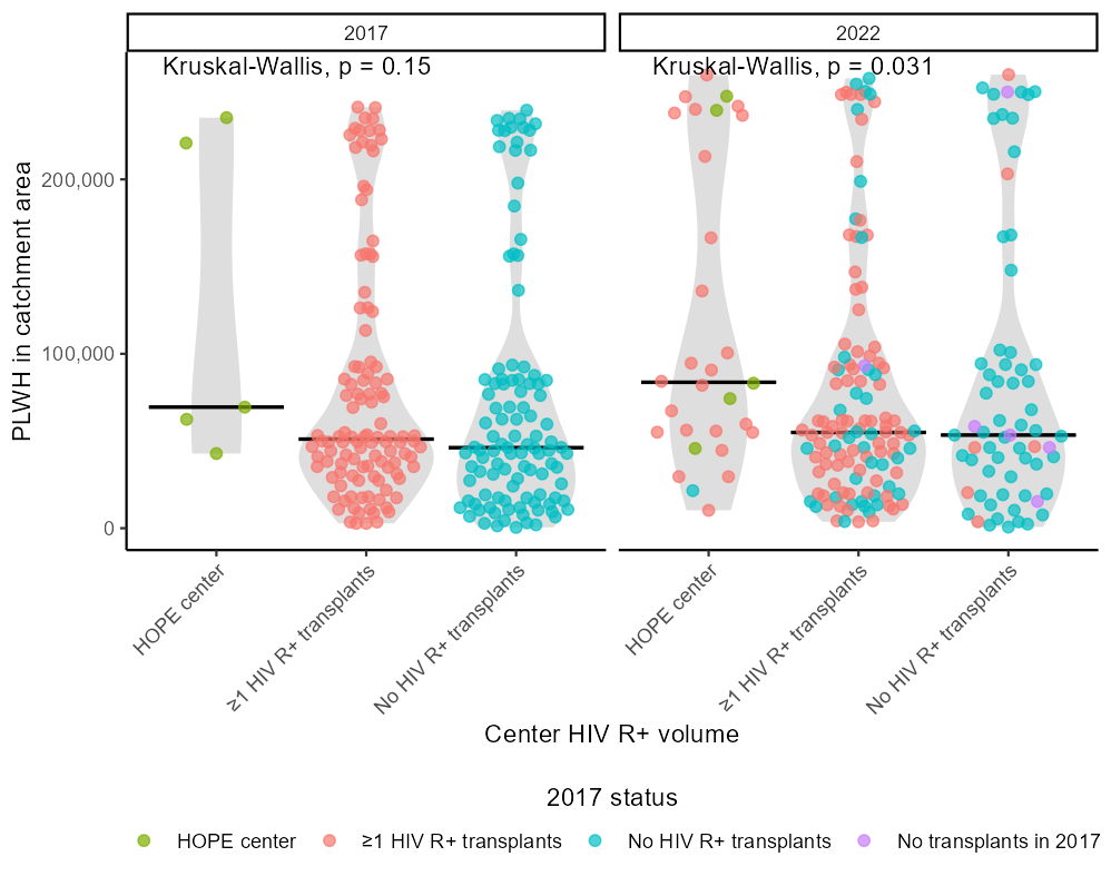
Beeswarm Plots
Beeswarm plots display the distribution of catchment-level population proportions across centers.
Each point represents a transplant center, with the distribution shown for each distance definition.
These plots illustrate variability in geographic access across centers rather than only aggregate proportions.